Prudential Investment Management (PGIM) UCITS Website
Creating PGIM’s design and research practice, I helped shift prioritization of technical constraints and internal opinions to a user-centric focus on discovery, deliverables, and processes.

Business Challenges
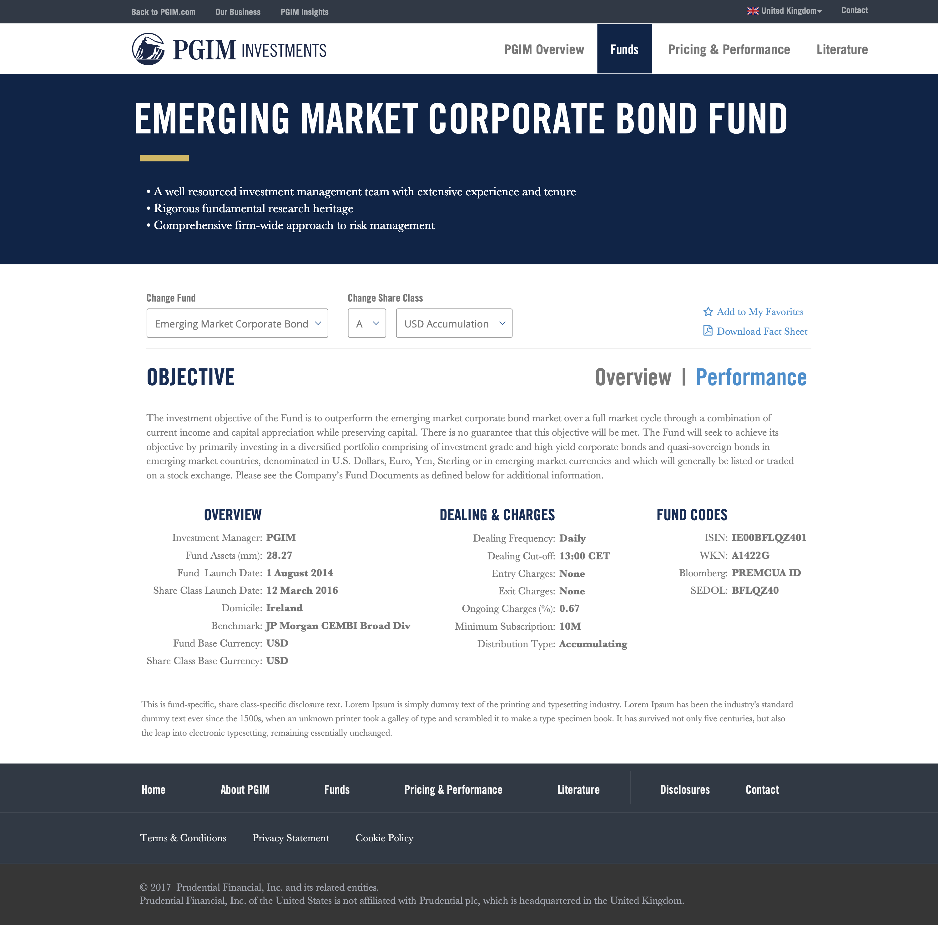
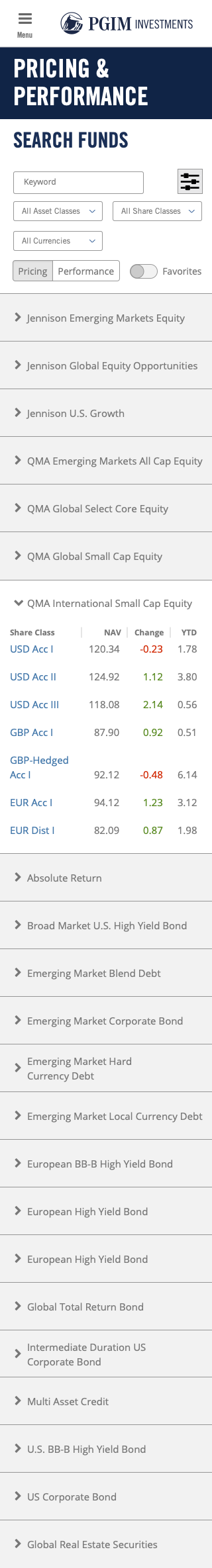
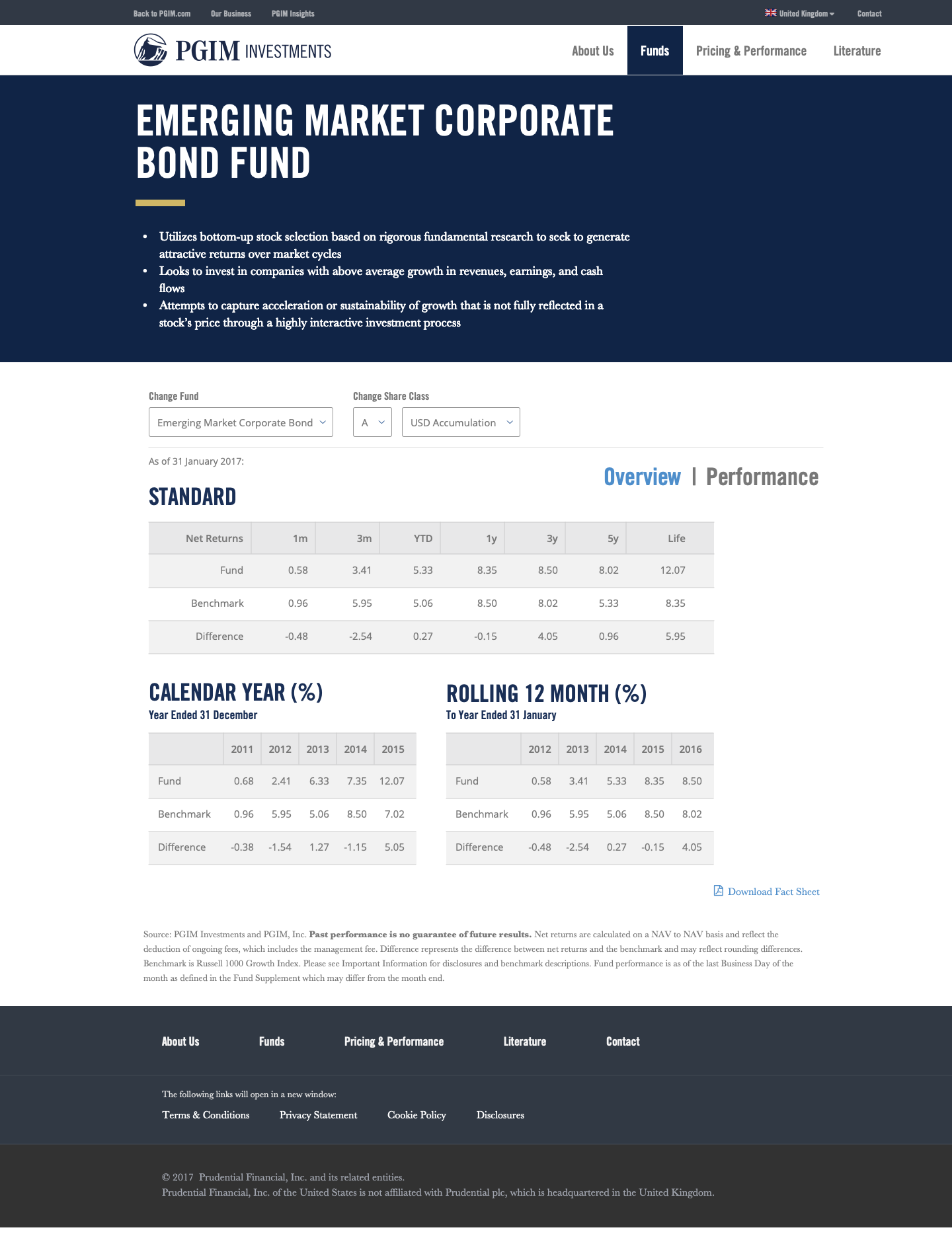
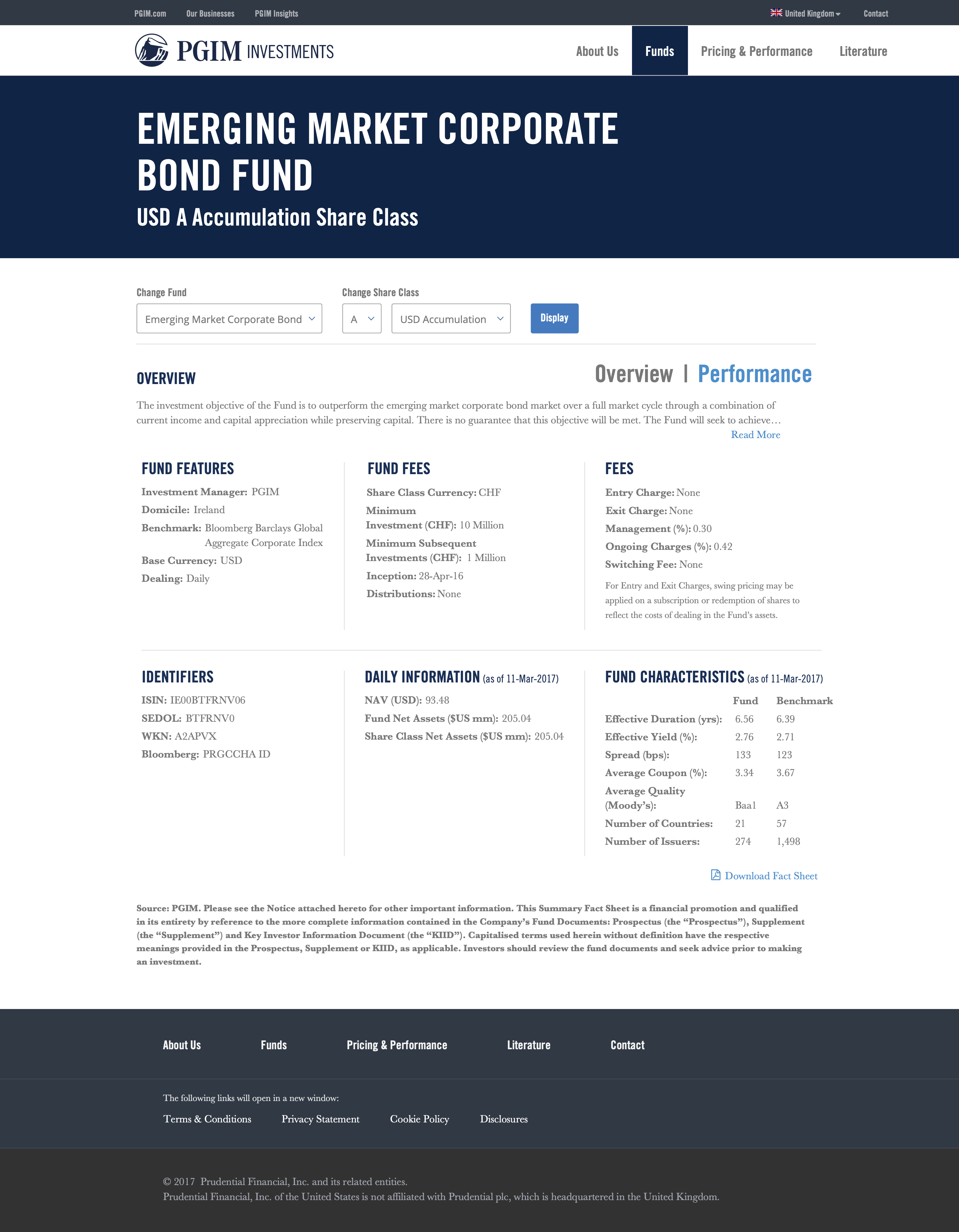
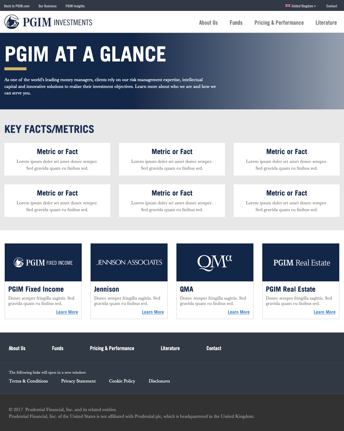
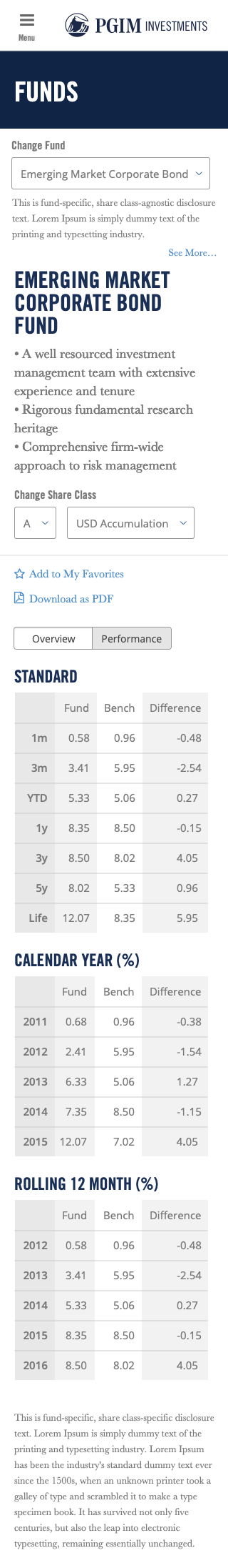
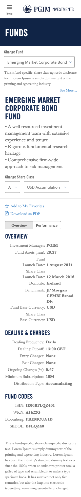
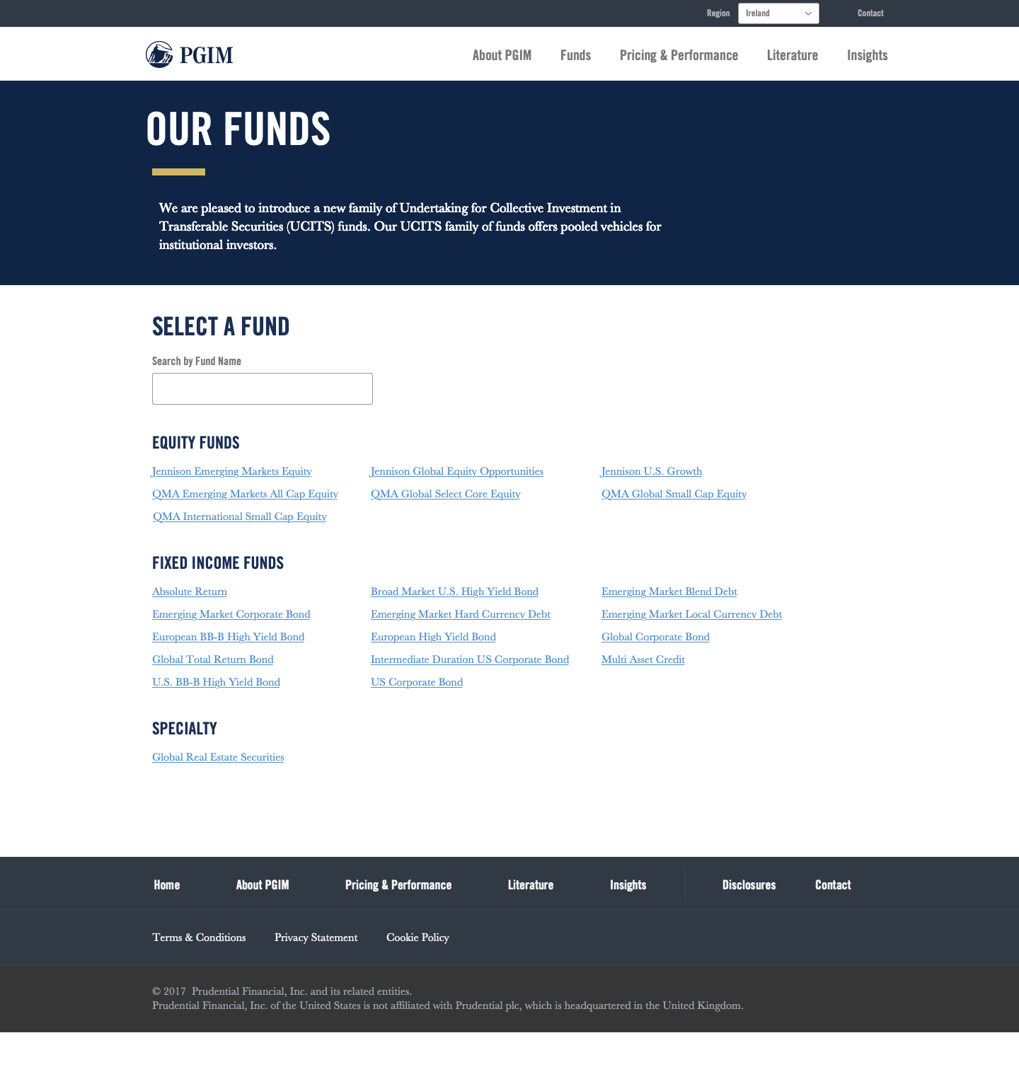
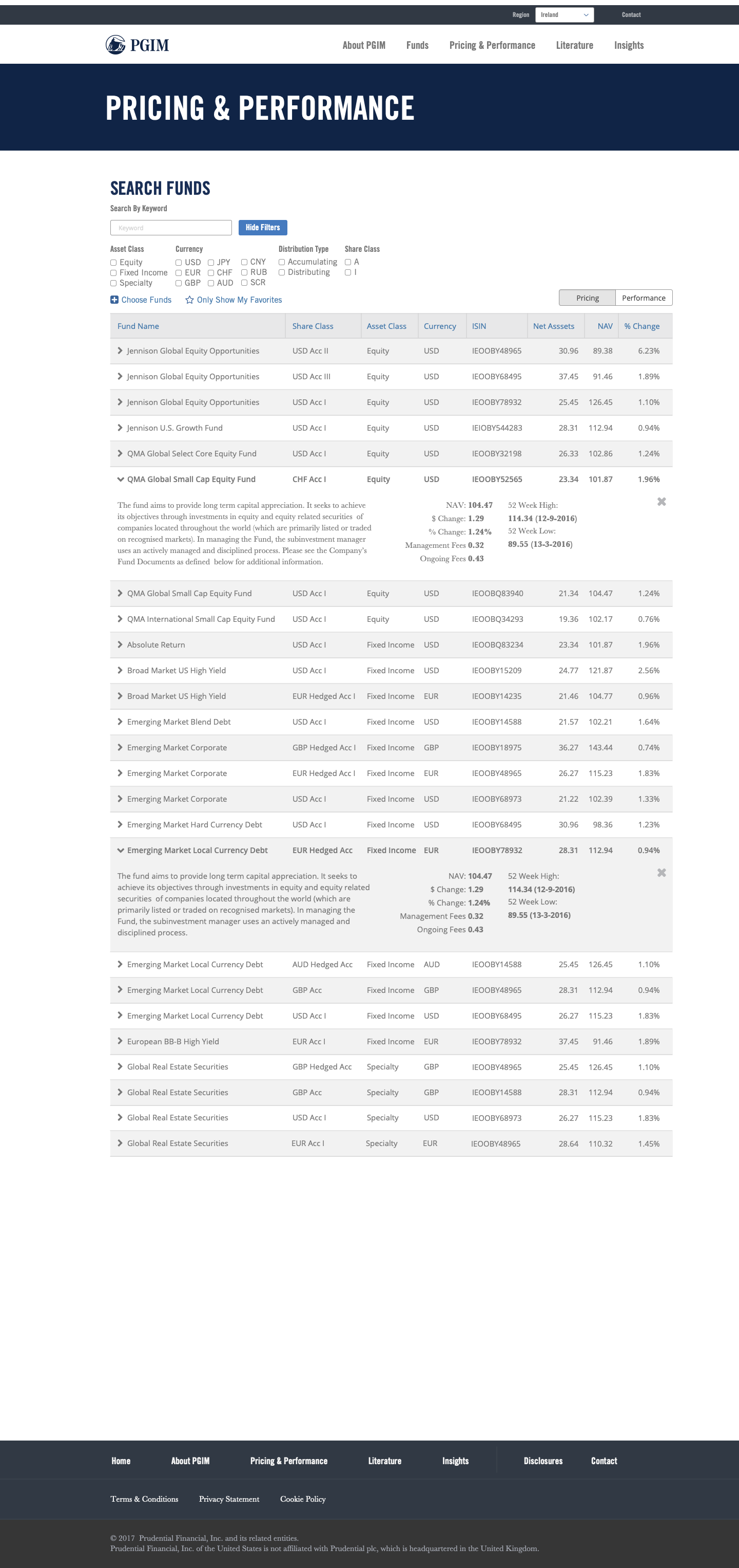
As PGIM prepared to launch their international mutual fund (UCITS) business, they needed an application that would let customers quickly find products that fit their individual, complex criteria. International markets were significantly less familiar with these products, their regulatory environments were more restrictive, and the products themselves were less varied and complex than their US equivalents. As a result, existing tools, built for the US, didn’t fit the bill. We needed a regionally-relevant tool for international customers to search, compare, and obtain details about these funds.
Role Challenges
The PGIM team hadn’t worked with UX resources before and I was initially asked to jump directly into creating mockups. The technology team traditionally worked on back-end enterprise technology and had very little experience interacting with internal users, let alone customers. They didn’t understand the value of discovery activities like competitive analysis or user interviews or the risks they would incur by not doing this homework.
The team saw corporate influence as a technical checklist: cybersecurity, database compliance, etc. were relevant to their work, but they were unfamiliar with the presence of experience equivalents like design systems and brand standards.

Process Challenges
A highly linear waterfall plan was already articulated by project management when I started my role in the project. This plan left little room for iteration and adjustment, particularly given the uncharted waters of the product and market they were attempting to build. Given the team’s inexperience working with end users, they hadn’t planned for user feedback and needed to account for smaller scale changes in their lifecycle.
A highly linear waterfall plan was already articulated by project management when I started my role in the project. This plan left little room for iteration and adjustment, particularly given the uncharted waters of the product and market they were attempting to build. Given the team’s inexperience working with end users, they hadn’t planned for user feedback and needed to account for smaller scale changes in their lifecycle.

Solution
Addressing the Team and Process
I emphasized the importance of the discovery process, particularly as we were creating a tool for a market that the technology team had never worked for. Using the marketing team as a channel for user feedback, I helped the team build a user community representing multiple regions, providing input and feedback throughout the design process. We developed personas (a process the technology team had never done before) and determined multiple user profiles, influencing the project plan to expand as we determined the release would not be a one-size-fits-all product.
I also conducted a competitive analysis to establish benchmarks for our product. Because UCITS were a relatively new area of business for many US financial companies, we benchmarked both UCITS and US-focused mutual fund sites. Our research quickly determined that US-targeted product searches were too feature rich and complex for the international market, but these sites still provided valuable guidance for a more simplified flow and UI.
I also encouraged a connection with the centralized Prudential design team to ensure that we were following brand and other design system standards and weren’t delayed by a corporate review process late in the project. This large, internal, centralized team provided services to many lines of business at Prudential, but hadn’t gained a foothold in the PGIM line of business. They were happy to work with a dedicated resource that understood their methodology and culture; my partnership with this central team quickly strengthened as I became their point of contact in the PGIM line of business. By collaborating with the central design office, I received valuable guidance and critique on my work, helped them develop a role on PGIM projects, and gave PGIM a seat at the table during corporate design discussion.

Finally, I introduced the team to a the idea of a small-release, iterative development and deployment process. It quickly became clear that the individual contributors relished the idea of working in Agile, but the project management team didn’t have much experience with this approach. We identified opportunities to organize our work as smaller tasks and orient it around user needs, rather than coding tasks. This approach helped us market the project internally, as initial release dates (of the minimum viable product) were accelerated and technology team could show more capability to keep up with the pace of the financial side of the business.
Business Solution
The team was very enthusiastic to have a designer on staff – because they looked forward to detailed mockups that spelled out exactly how the UI should look and behave. However, we faced three classic problems with moving directly into high-fidelity design:
- We didn’t have brand or design system guidance for the business
- We had not consulted with any users
- The development process didn’t account for revision
As I addressed the process and organizational challenges that led to these problems, I still needed to make initial progress on the design – it was clear that standing still would not be tolerated. So I set an expectation that I would be delivering wireframes that would represent detailed data and content, as well as clear interaction design, but would be have very little visual design fidelity. I saw this as an opportunity to use these wireframes to solicit user feedback from internal stakeholder and the the nascent user community I was building, while remaining totally clear to both parties that we were not committing to the designs they were reviewing. Meanwhile, I collaborated with Prudential’s central design team to learn their design system and determine which branding attributes were relevant to the UCITS project.
Once feedback and direction was collected from users, internal subject matter experts, and the central design team, I implemented designs that revised the wireframes based on their feedback and increased the branding and visual design fidelity to match the initial expectations of the development team. By iteratively progressing through this process, I managed the team’s expectations, ensured a well-informed direction for the design, and established a precedent for a more modern agile development process.


Results
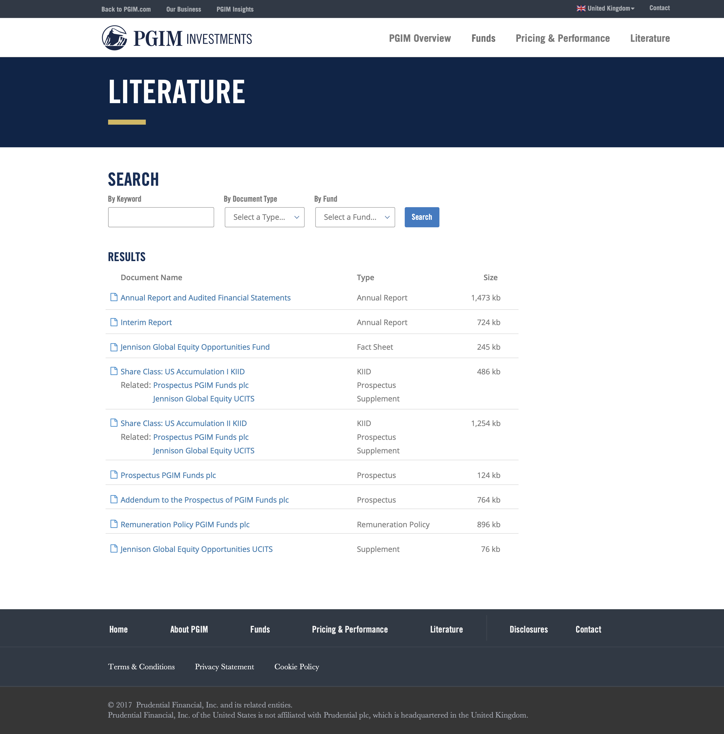
The resultant design blended marketing content and a robust application that was both scalable and functionally appropriate for this new market. Designed to be fully responsive across desktop, tablet, and phone, it allowed additional data and content to be added as the market matured and users became more reliant on the tool. It was applauded for its adherence to corporate branding and interaction standards and elements of the design were later applied to existing tools like PGIM’s US-oriented mutual fund search.
While the design outcome was very successful, I consider this project to be an equal example of winning UX implementation and teamwork. By compromising pre-existing expectations with tried and true methodology, collaborating with newly discovered internal partners, and helping to introduce contemporary processes, I helped create an environment where UX could not just flourish in this project but for years to come.