Fidelity UX Design System Site
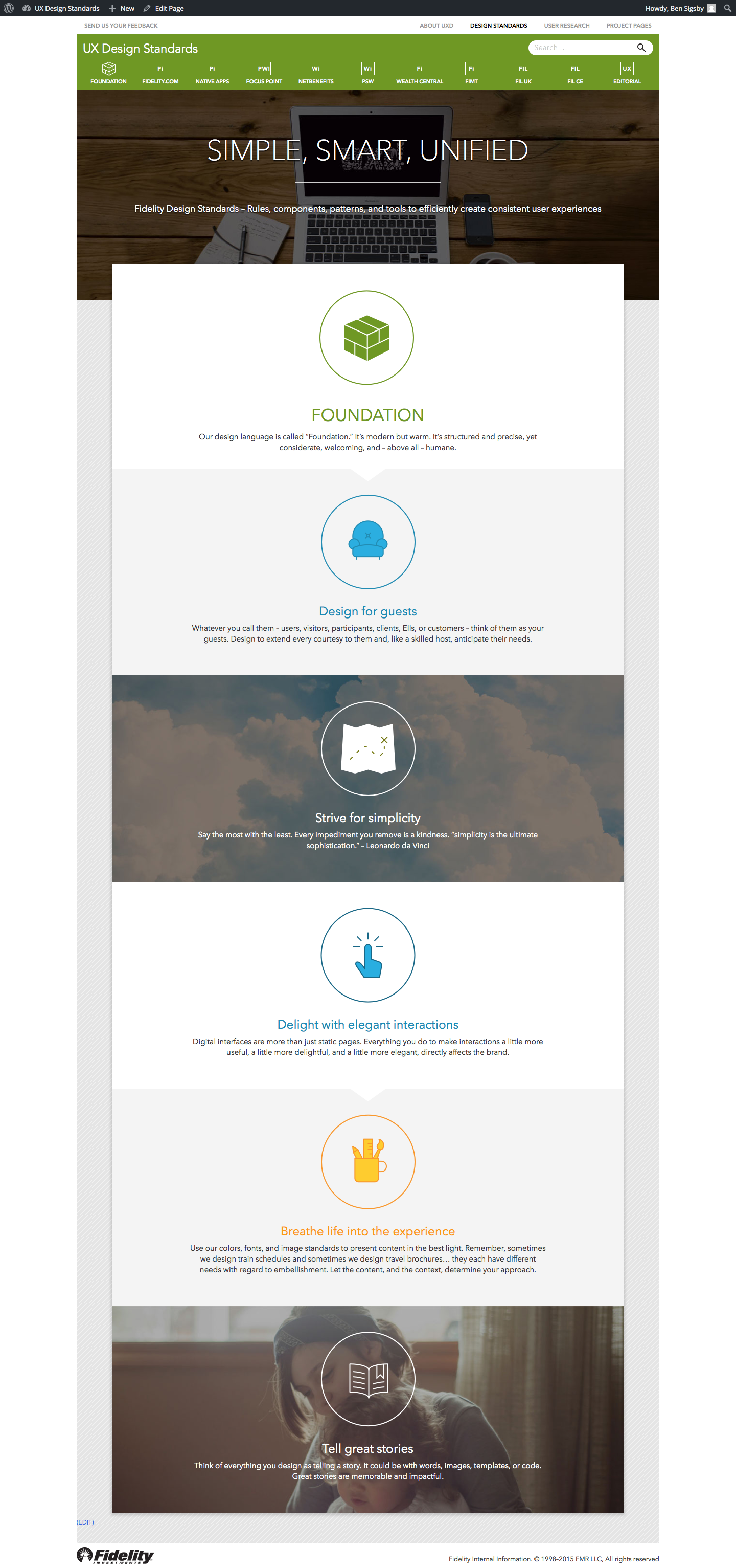
With 300+ UX designers, an articulated design playbook is critical to Fidelity’s success. This design system established core principles for our designers to aspire to, defined the specific patterns for reuse, and provided tools for implementation such as code snippets and stencils (for products like Axure, Adobe XD, Sketch, etc.).

Overview
Problem
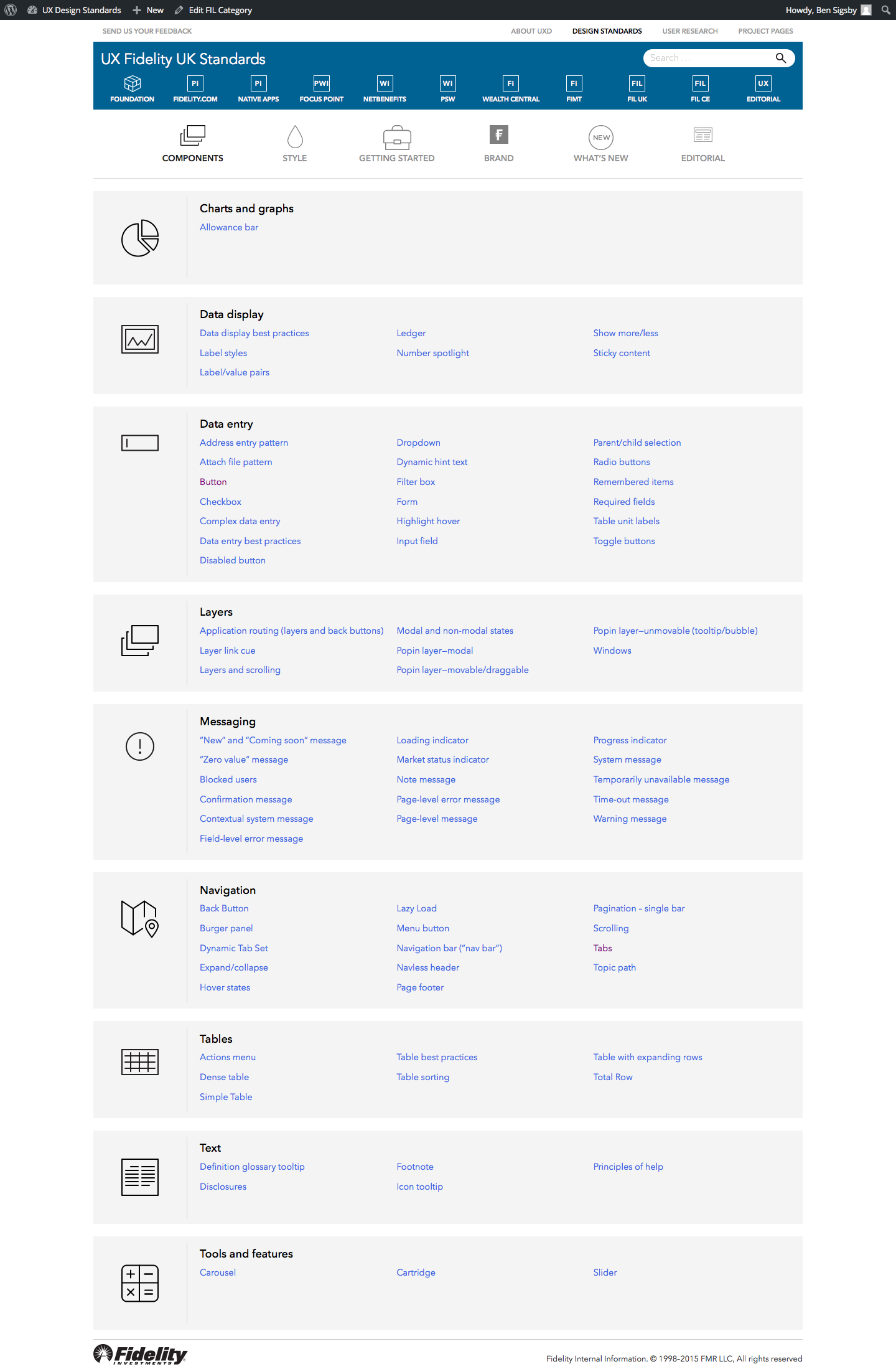
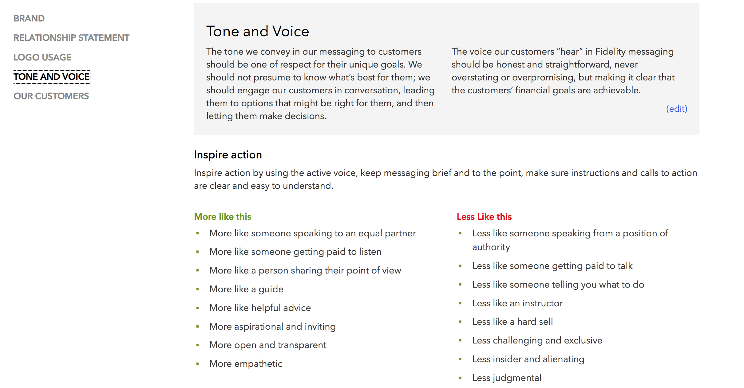
Fidelity’s 50+ project teams needed to design consistently and quickly. We also needed to provide a reference for external partners to reduce subjective debate around our deliverables. The existing resource contained only flat visuals and textual descriptions of the standards and was difficult to maintain.
Role
Alongside our UX Senior VP and Executive Creative Director, I was a primary stakeholder for the site. Based on persona development and user testing, I provided functional, content, and interaction requirements and managed the project to a successful launch of the initial Personal Investing site. I then led the roll-outs to the rest of the UX portfolio’s business lines.


Audience
The primary user of this tool was a UX or visual designer working in our personal, workplace, or institutional investing business lines. Secondary personas included development partners who would consume the designs and business sponsors who would be interested in the justification behind our work.
Constraints
Fidelity’s UX Design department operates as an internal agency. Building an internal tool, with no direct client funding, means working within a tight budget. Some difficult decisions led to the backlogging of some key requirements; prioritizing delivery over perfection is always tough, but doing so ensured that we could get feedback ASAP.
Design Process
My leadership on this project focused on:

Scalable design systems
Management across multiple sites

Enterprise design
Program management
Leadership by informal influence
While we knew our audience well (we sat next to them), we started the discovery phase by identifying our users more granularly: breaking down our “UX Designer” into specific project teams and identifying their unique needs. So that we could ensure their buy-in to the finished product, we also explored what value could be provided to those outside of our department.
After identifying a core set of functional requirements, we created low fidelity prototypes and ran them by our prospective users. This exercise helped us nail down the proper hierarchy and tagging structure for the content, which proved to be the most important part of the project.
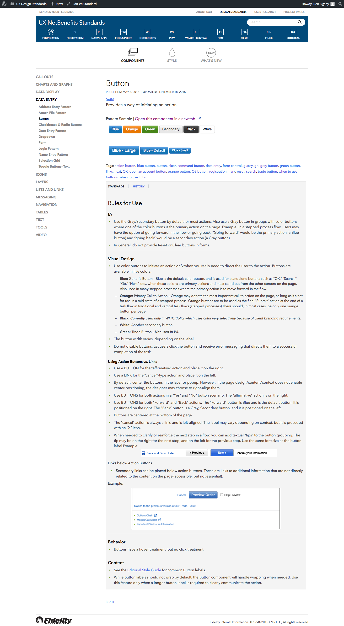
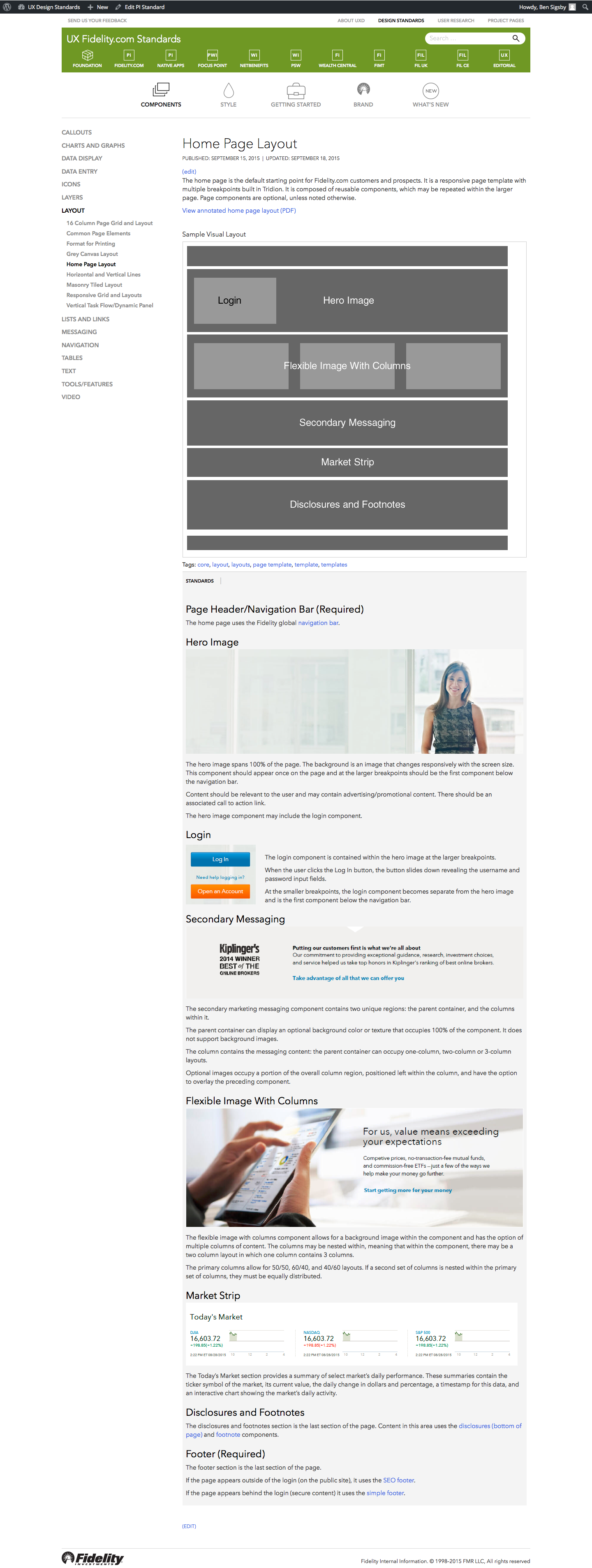
While we prototyped, we also focused on the visual design. As opposed to many internal projects, the “paint job” for this tool was critical. We wanted our Design System to be a shining example of our designers’ best work. One of our top visual designers was “borrowed” to make our site a great example of how using our standards enabled great aesthetic value.
Then, we built it.
After launch, it would be imperative to focus efforts on the quality of the content, not the grunt work. Building the site on a robust CMS platform minimized maintenance costs (one of the core value principles of the project) and expedited the deployment of the tool to other design portfolios, allowing us to scale at pennies on the dollar. We also placed a premium on measurement – by analyzing user behavior, we could determine where to invest our time and resources. A detailed set of metrics requirements were implemented to tell us what material our designers were referencing and what was missing. While our development partner implemented the page templates and content schema, my team and I built and tagged the content in the CMS. In tandem, we created an interface with the code repository to include code samples of the standards so projects could easily implement them. Finally, we built stencils for use in our design tools like Sketch, Axure, and various Adobe products to speed up design production.

Results
The deliverable was a vastly improved tool for designers and developers. It also gave the design teams a support mechanism for discussions with their partners who often pushed them to sacrifice the user experience to save budget or time. By establishing a rich resource (and dedicating resources to it’s maintenance and expansion), we increased the efficiency of our design and development processes and allowed the our projects a greater focus on site-wide consistency and cohesion. The initial launch was an immediate success and we are now rolling out to four additional areas of the UX portfolio.