Financial Tracking Technology
Pulling together twelve separate products for Financial Tracking Technology, I created a system that emphasized data visualization and warp-speed navigation techniques to help users identify and resolve critical compliance issues quickly.
Pulling together twelve separate products for Financial Tracking Technologies, I created a system that emphasized data visualization and warp-speed navigation techniques to help users identify and resolve critical compliance issues quickly.
Project Summary
Most financial compliance software providers only solve a small piece of the functional puzzle for Chief Compliance Officers. Financial Tracking Technology stands out by delivering compliance professionals a comprehensive collection of functional “modules”. I was asked to help improve the user experience of each of these modules and then pull them together into a single branded application, to be sold as a enterprise solution.
Skills
This project exercised a number of aspects of my UX background:

Data Visualization

Interaction Design
Design Systems

User Research

Info Architecture

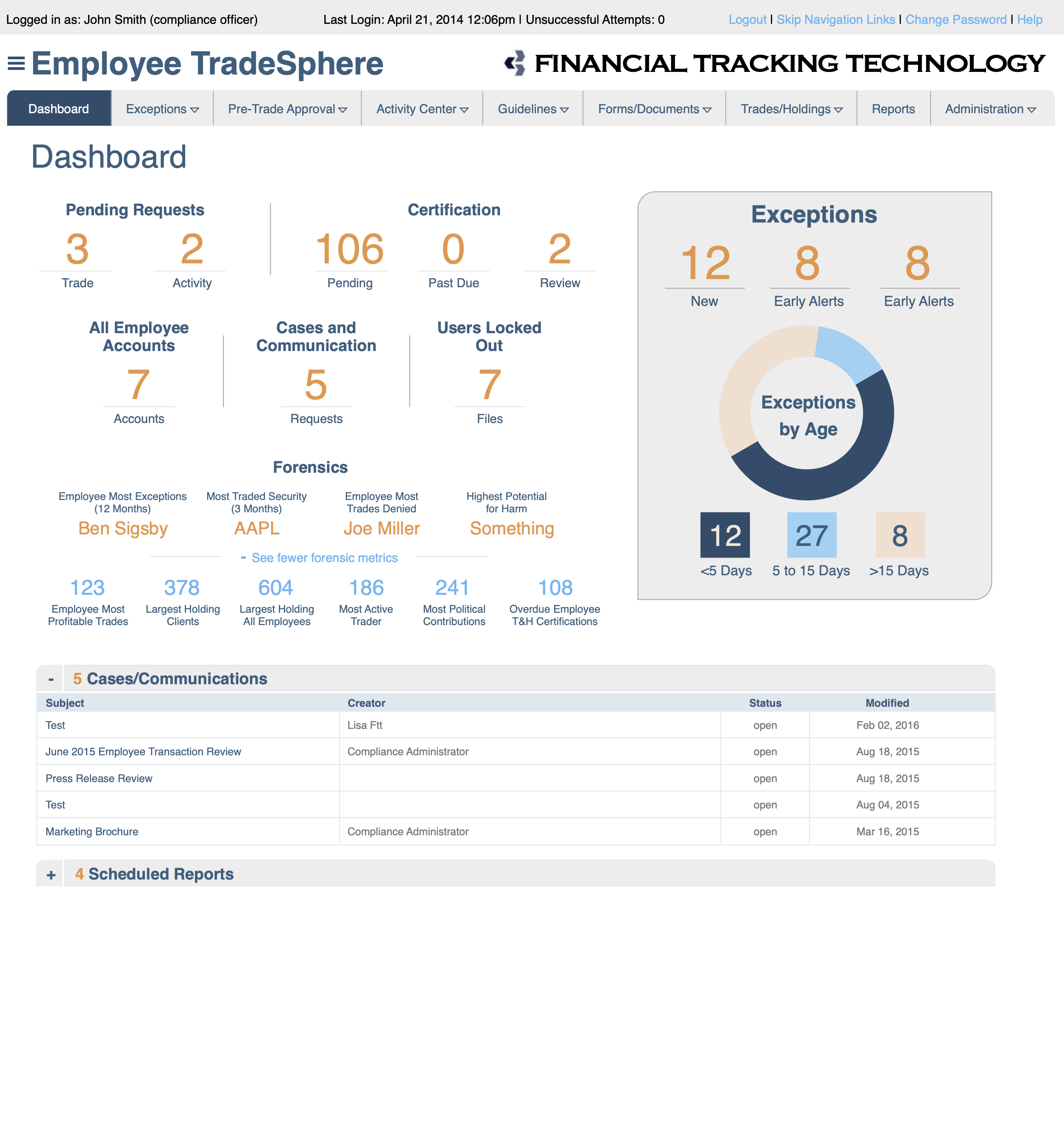
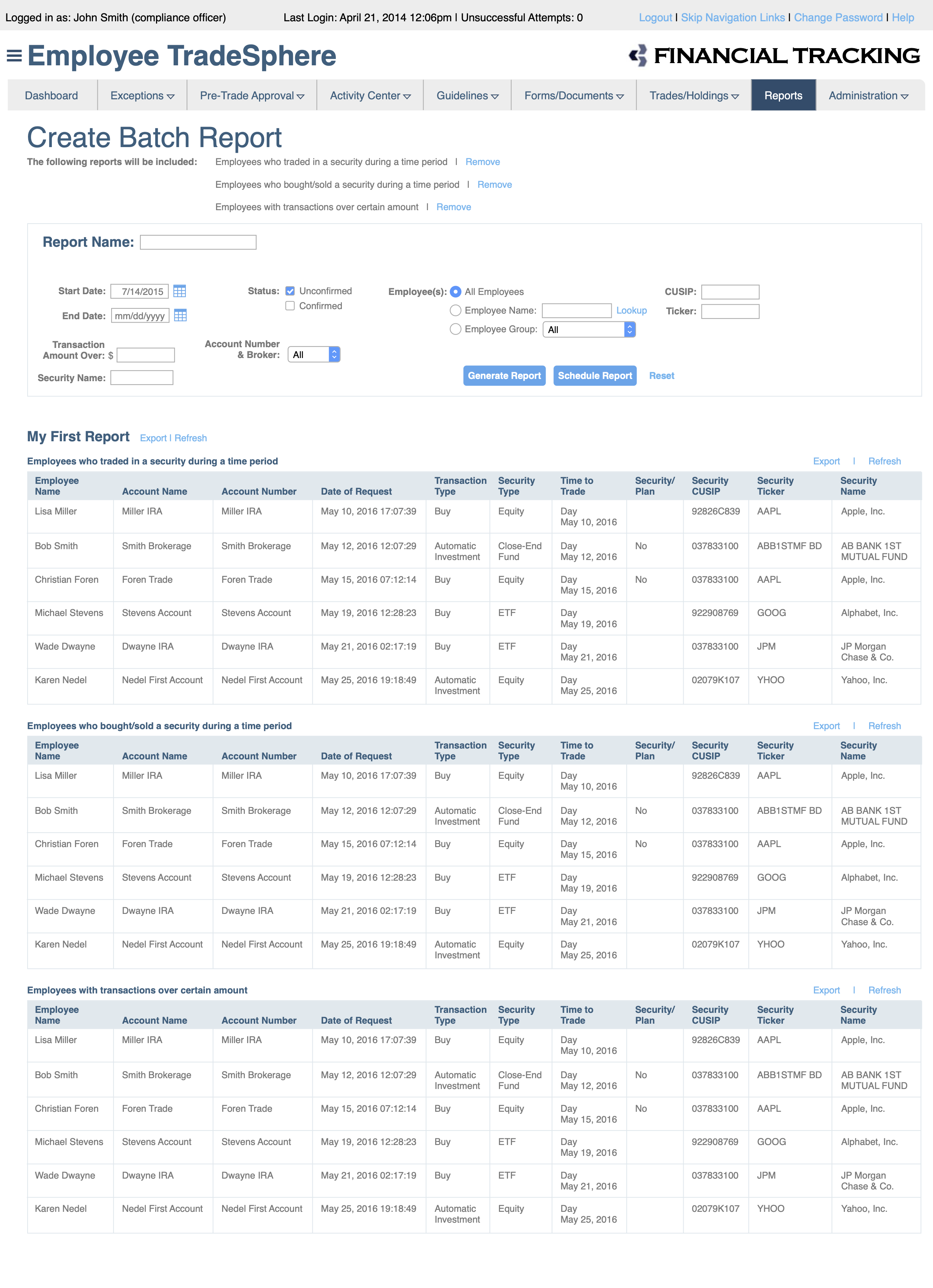
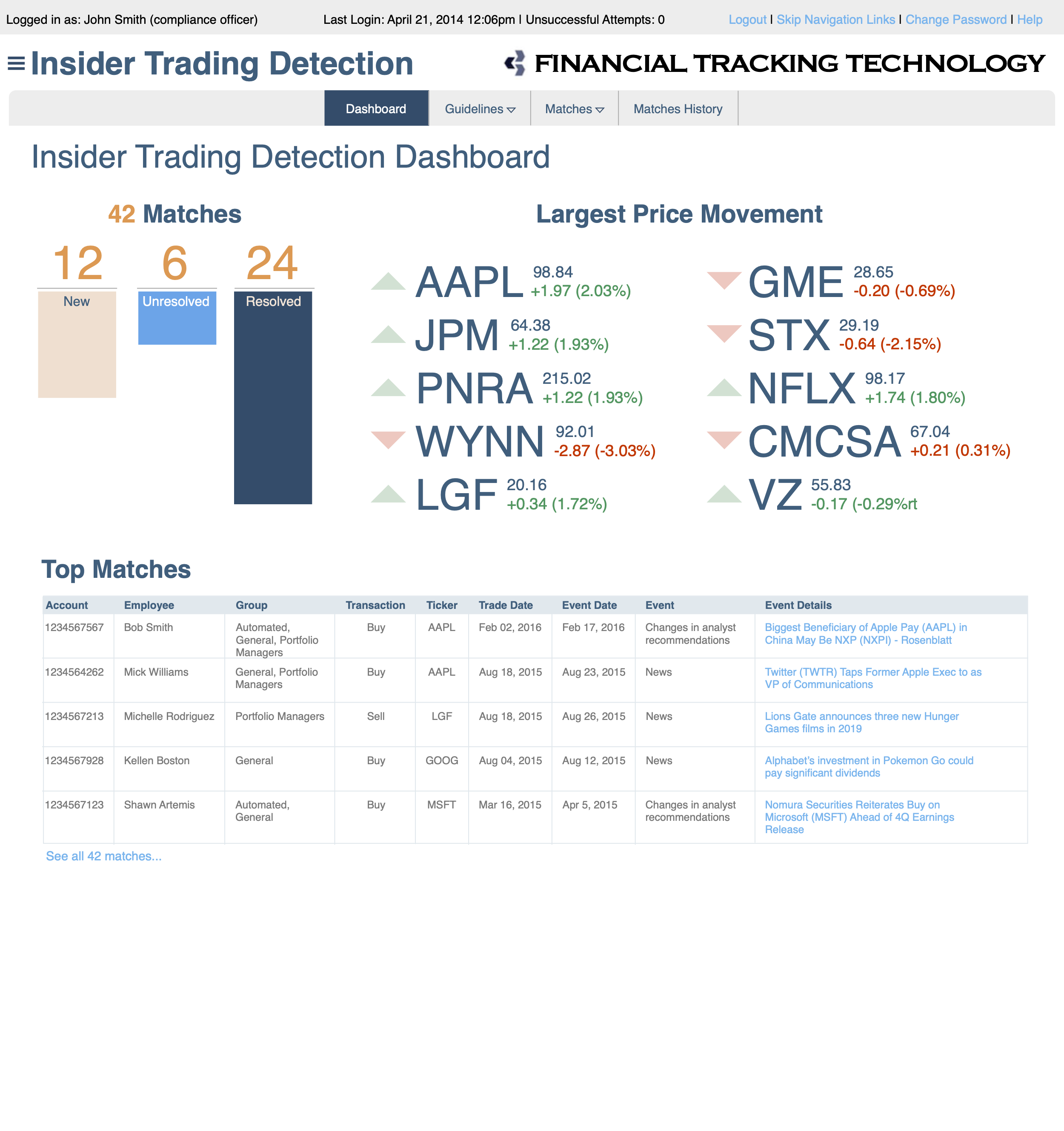
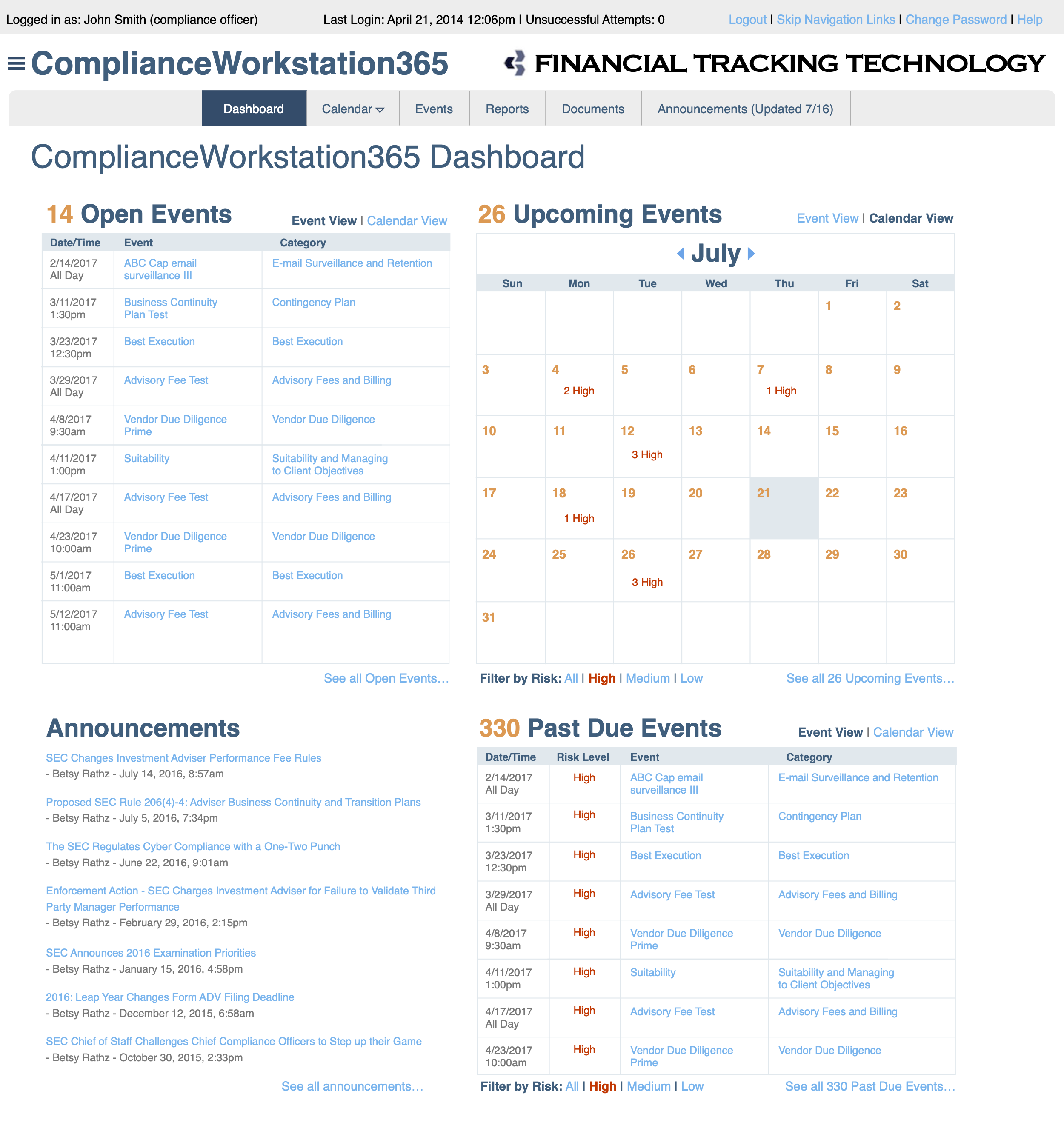
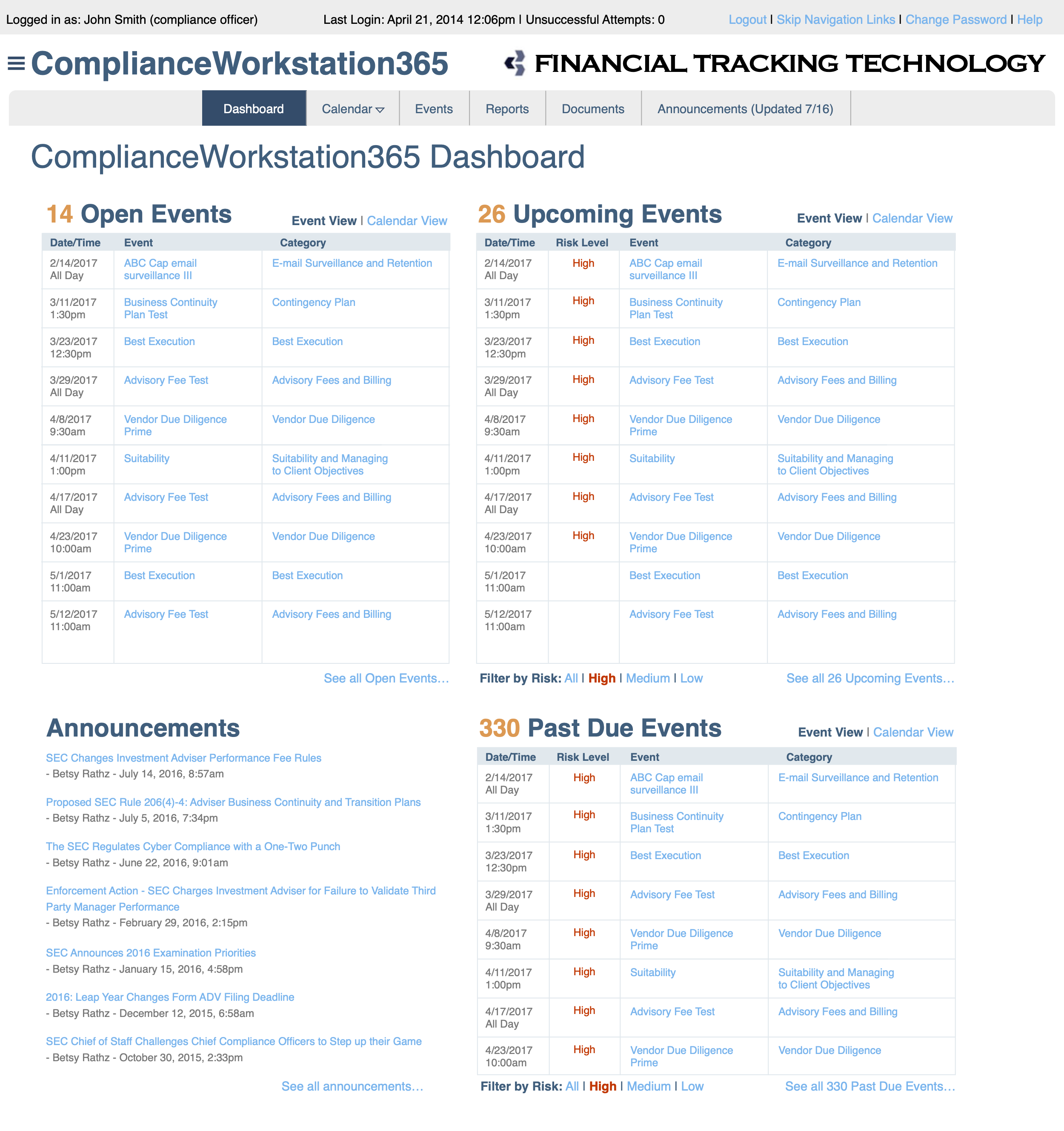
Each module is anchored by a Dashboard that summarizes large amounts of data. These Dashboards drill down into Reports configured by the user. Optimizing the Dashboards relied heavily on data visualization and visual design skills, while interaction design expertise was critical when streamlining the Report UI. Meanwhile, solid information architecture and user research skills proved instrumental when pulling together the various pieces of the system into a single, easy to navigate, platform.

Challenge
Financial Tracking Technology delivered financial compliance services through a series of small- to medium-sized software products. Ranging from employee trade monitoring and insider trading detection to anti-corruption and money laundering surveillance, their software modules were sold individually, usually packaged with two or three components for a single small client (such as a local bank, trading firm, or financial advisor).
However, to position the company for market expansion and potential acquisition, they needed to appeal to larger clients. These clients would need their entire suite of twelve products, marketed as an integrated enterprise solution. I was asked to help merge these products into a single consistent, cohesive, and blended user experience, fulfilling the promise of a single financial compliance platform.

These products had been developed by independent, uncoordinated teams. The design challenge was compounded by the reality that these teams did not have established processes to work together. My experience working in large organizations was an asset to help connect related development efforts. In particular, my experience creating and growing design systems enabled us to centralize the UI code and reduce the amount of coordination necessary to deliver a fully-realized platform.


Solution
First, I looked at the existing, individual component UX and performed a gap analysis to estimate the work needed to bring the products together. This included a map of the individual products’ information architecture to help identify inconsistencies and overlaps in the organization of the modules. This process uncovered a number of discrepancies, though we waited to resolve them until we determined how to merge the modules into a single platform.
Next, I worked with the product managers of each of the modules to determine overarching features that should be added at the platform level to weave the modules together. We looked at common traits shared by potential clients that could guide our decision-making. Ultimately, it was determined that most clients had similar organizational structures within their compliance department: upper-level executives were responsible for a larger number of compliance roles, with a multiple direct reports who managed specific areas matching our modules’ functionality. Purchasing decisions were made by the senior compliance executives, so it was important to consider both the usability and curb-appeal for this audience when designing the structure of the platform.
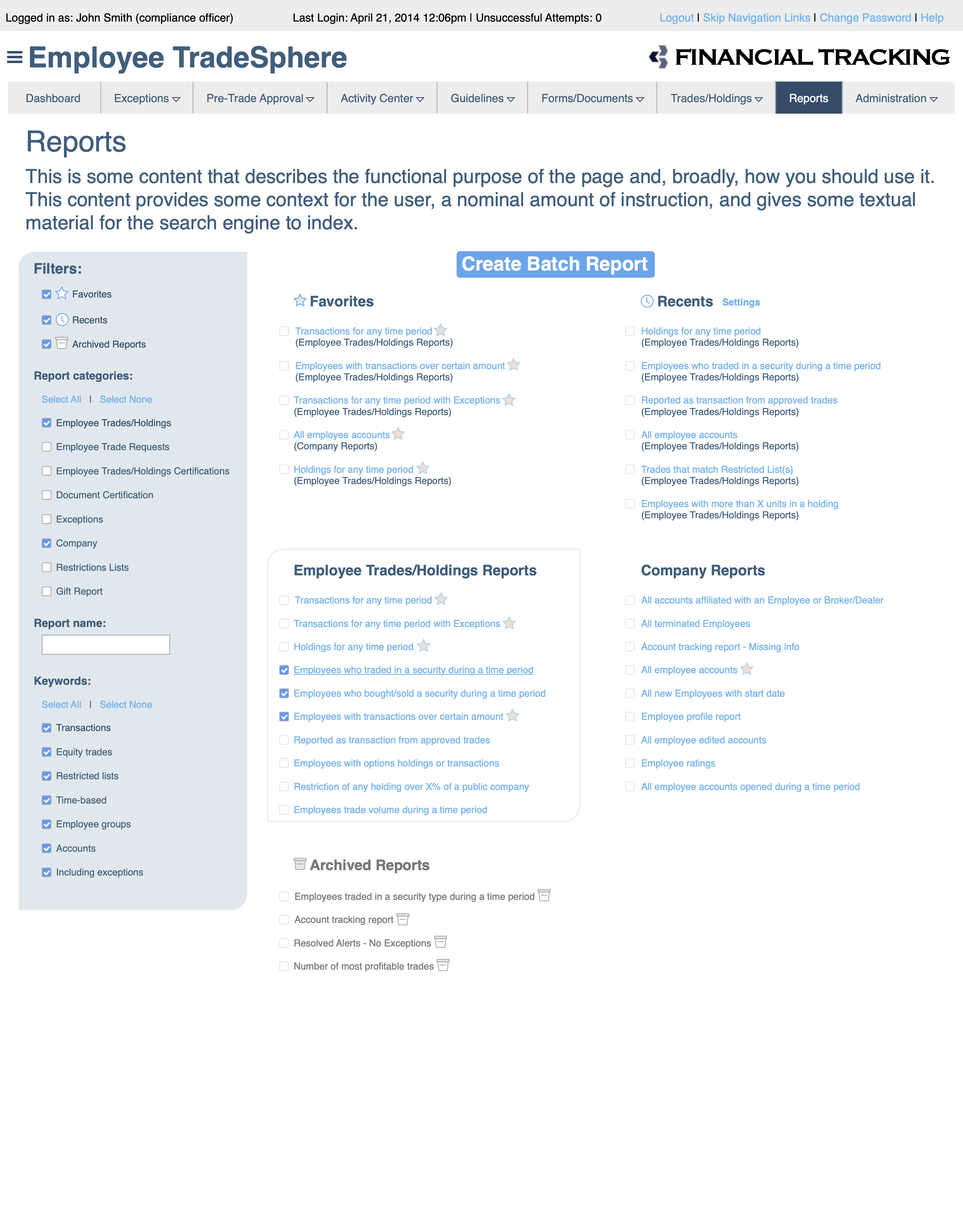
To help pull together the disparate elements of the existing system, I designed a series of Summary screens, targeted at Chief Compliance Officers who needed to scan multiple areas of responsibility. These screens highlighted key metrics that these executives needed to monitor and then allowed a quick path to drill down to the underlying data that they would reference less frequently. However, these Detail screens were the domain of the direct reports: discipline managers who relied on this data to manage their teams on a daily basis. The Summary screens also served as reports to enable efficient, data-oriented conversations between the CCO and their team discipline leaders.
To better serve the discipline leaders, I designed a system of filtering behaviors that provided an range of visibility levels: some filters completely excluded records that didn’t meet the filter criteria, while other data sets just visually de-emphasized non-matching records without completely obscuring them. By developing a number of these techniques as patterns with defined use cases, I enabled developers to apply them throughout the system based on the level of visibility the user needed in each scenario without granular design guidance.
I also mapped the data used throughout the system to identify opportunities to provide “warp zones” between data sets. These quick links allowed users who were viewing one group of data to quickly jump to a related data set without clicking through a cumbersome set of breadcrumbs and navigation.
For example, a manager might be reviewing a series of trades made in the last week to monitor for insider trading behavior. After noticing a frequent pattern of short sells by a particular employee, the manager may want to review that employee’s overall compliance profile. In the previously fragmented structure of this system, they would launch a different application and review the employee’s information in an unrelated UI. My new design integrated that information into the current insider trading screen, using a standard UI component that could be reused in multiple contexts. By designing shortcuts to this data, I accelerated the ability to cross-reference data throughout the platform and enabled development efficiency with patterns that could be implemented once and leveraged repeatedly.